In this section, we provide recommendations to guide your inclusion of accessible, image-based content.
What are images?
Images are non-text elements that include photographs, illustrations, diagrams, pictures, charts, graphs, and maps.
File types used: GIF, JPG, PNG
Why are you including the images you have selected?
Before you can determine what to do to make an image accessible, you must identify its purpose or value to your textbook. Consider the following questions:
- Does your image serve a functional purpose? In other words, is it conveying non-text content to students? If so, you should:
- Does your image serve more of a decorative purpose? In other words, is it primarily a design element that does not convey content? If so, you should:
- avoid unnecessary text descriptions
Who are you doing this for?
This work supports students who:
- Are blind or have low vision, like Jacob
- Have poor contrast vision
- Are colour blind and cannot differentiate between certain colours
- Use a device with monochrome display
- Use a print copy that is in black and white
- Have limited Internet access and cannot download images
- Have a form of cognitive disability

What do you need to do?
Determine the role of each image used in content as either functional or decorative. Once that has been decided, select how each image will meet accessibility needs by providing descriptive text in a variety of ways. Figures, such as charts and graphs that rely on colour to convey information, should also be evaluated for accessibility by students who are unable to distinguish between or see colour.
Functional images
Consider what your content page would look like if the images didn’t load. Now try writing alternative text for each image that would work as a replacement and provide the same information as the image.
There are three ways to provide alternative text descriptions for images:
- Describe the image in the alt tag
- Describe the image in the surrounding text
- Create and link to a long description of the image
As you work on developing your alternative text descriptions, keep the following recommendations and guidelines in mind:
- Remember that alternative text must convey the content and functionality of an image, and is rarely a literal description of the image (e.g., “photo of cat”). Rather than providing what the image looks like, alternative text should convey the content of the image and what it does.[3]
- For relatively simple images (e.g., photographs, illustrations), try to keep your text descriptions short. You should aim to create a brief alternative (one or two short sentences) that is an accurate and concise equivalent to the information in the image.
- For more complex images (e.g., detailed charts, graphs, maps), you will need to provide more than a one- or two-sentence description to ensure all users will benefit from the content or context you intend to provide.
- Leave out unnecessary information. For example, you do not need to include information like “image of…” or “photo of…”; assistive technologies will automatically identify the material as an image, so including that detail in your alternative description is redundant.
- Avoid redundancy of content in your alternative description. Don’t repeat information that already appears in text adjacent to the image.
Alt tags
An alt tag refers to the alt attribute (alt is short for alternative) within an IMG tag. All images uploaded into Pressbooks have an alt tag, but for them to be useful, you need to insert an image description.
Alt tags are used in two cases:
- When an image doesn’t download due slow Internet, the alt tag content will display instead of the image.
- For people who are visually impaired and use screen readers, when a screen reader finds an image, it will read out the content of the alt tag.
Alt tags should be no longer than 100 characters, including spaces and punctuation. This is because when a screen reader finds an image, it will say “Graphic” before reading out the alt tag. If the alt tag is longer than 100 characters, the screen reader will interrupt the flow of text and say “Graphic” again, before continuing to read out the alt tag. This can be confusing. For images that require descriptions longer than 100 characters, see the section on long descriptions.
To edit an image’s alt tag in Pressbooks, click on the image and select the PENCIL icon (edit). Under image details, there will be two textboxes: one titled “Caption” and one titled “Alternative Text.” The “Caption” box contains the image’s caption, which appears under the image in the visual editor. The “Alternative Text” box is where you describe the image.
Descriptions in surrounding text
You can use the surrounding text to provide the same information as conveyed by the image. This is often the best option for complex images because it makes the information available for everyone, not just those using the alt tags.
If you are editing someone else’s work for accessibility, you are probably not at liberty to start adding to the main text. However, if you are the author, this is the best and easiest option.
If an image has been adequately described in the surrounding text, you can either provide a few-word description of the image in the alt tag or follow the procedures for decorative images.
Long descriptions
If an image requires a description longer than 100 characters and adding an explanation to the surrounding text isn’t an option, provide a link to a long description instead. To do this, create a section at the end of the chapter for all long descriptions and use links to allow people to easily switch between the image and its long description.
Figure 1.1 shows an image from Introduction to Sociology – 2nd Canadian Edition that requires a longer description than what can fit in an alt tag. As such, at the end of the caption, there is a link to the image’s long description.
Anyone using this textbook can access this long description by clicking on the long-description link, which will take them to the long description at the end of the chapter (or by flipping to the end of the chapter in the print version). This will also work for people using screen readers who are navigating through the book with a keyboard.
Curious about how this works? Try clicking on the [Long Description] link in the caption of Figure 1.1.
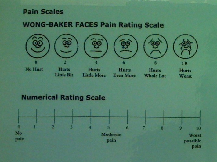
Figure 1.1 The Wong-Baker Faces Pain Rating Scale helps health care providers assess an individual’s level of pain. What might a symbolic interactionist observe about this method? [Long Description]
How to set up a long description for an image in Pressbooks
Adding a long description to an image in Pressbooks can be complicated, but the following four steps will help guide you through the process.
Step 1: Add an alt tag
Even though you will be providing a long description, the image still needs an alt tag. In the Alternative Text field in the image editor, provide a brief image description (only a few words), and state that there is a long description available.
- Example: Wong-Baker Faces pain rating scale. Long description available.
Step 2: Insert a link to the long description in the image’s caption
Provide a link to the long description in the caption of the image.
- At the end of the caption, add “[Long Description]” to use for the link text.
- Create a unique ID for the image. (In this case, the ID is “fig1.1”.) The ID can be whatever you want, but if you have multiple images that require long descriptions, it is best practice to establish a convention for creating IDs to keep them consistent.
The following table displays how the caption will look in the visual editor view and in the image editor view.
| Visual editor view | Figure 1.1 The Wong-Baker Faces pain rating scale helps health care providers assess an individual’s level of pain. What might a symbolic interactionist observe about this method? [Long Description] |
|---|---|
| Image editor view | Figure 1.1 The Wong-Baker Faces pain rating scale helps health care providers assess an individual’s level of pain. What might a symbolic interactionist observe about this method? <a href=”#fig1.1″>[Long Description]</a> |
Step 3: Set up the long description
- Create a “Long Description” heading at the end of the chapter. Set it as Heading 1. All long descriptions will be added to this section in the order that the images appear in the chapter.
- Under the “Long Description” heading, insert the image’s figure number followed by the long description.
- Example: Figure 1.1 long description: The Wong-Baker Faces pain rating scale uses cartoon faces to illustrate the different levels of pain that correspond to a numbered scale from 1 to 10. Zero is smiling, 2 is a small smile, 4 is a straight face, 6 is a slightly sad face, 8 is a big sad face, and 10 is a bigger sad face that is crying.
Step 4: Link the long description to its image
- Insert a link at the end of the long description that takes users back to the original image. This will make it easy for people to navigate back to their spot in the chapter.
- Example: Figure 1.1 long description: The Wong-Baker Faces pain rating scale uses cartoon faces to illustrate the different levels of pain that correspond to a numbered scale from 1 to 10. Zero is smiling, 2 is a small smile, 4 is a straight face, 6 is a slightly sad face, 8 is a big sad face, and 10 is a bigger sad face that is crying. [Return to Figure 1.1]
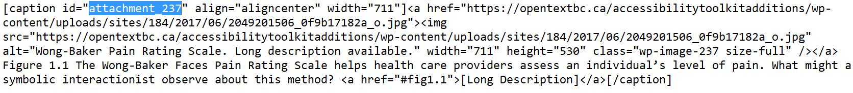
- To link back to the image, you will need a new unique ID. Images automatically generate their own unique IDs, which you can use to link to them. Here is how to find an image’s unique ID:
- Search for the image in the HTML (text) editor. Hint: use [Ctrl/Command] + [F], and then search for “Figure 1.1 The Wong-Baker”
- You will see something like this:

The ID for Figure 1.1 is attachment_237, as highlighted in the above image.
- Copy the caption ID, return to the visual editor, and find the long description. Use the caption ID as the link for [Return to Figure 1.1].
- Save the chapter and test the links to make sure they work. If they don’t, double check your IDs.
Now that you have reviewed the steps to add a long description to a Pressbooks image, see Chapter 8 of the Introduction to Tourism and Hospitality in B.C. open textbook for an example of what long descriptions look like in practice.
Decorative images
If an image does not add meaning, i.e., if it’s included for decorative or design purposes only, or if the image is adequately described in the caption and/or surrounding text, it doesn’t need an alt tag. Including alternative text descriptions for decorative images “simply slows the process down with no benefit because the screen-reading software vocalizes the content of the [alternative text description], whether that alternative text adds value or not.”[4] However, this doesn’t mean that you should leave an alt tag blank.
When a screen reader detects an image with a blank alt tag, it will read out the image file location. If the above picture about the The Wong-Baker Faces pain scale didn’t have an alt tag, a screen reader would say, “Graphic: https://opentextbc.ca/accessibilitytoolkit/wp-content/uploads/sites/184/2017/06/2049201506_0f9b17182a_o.jpg.”
When an image doesn’t require an alt tag, place two double-quotation marks (“”) in the Alternative Text field; this step will prompt the screen reader to say “Graphic” and move on to the caption.
Using colour
Consider what your images would look like if they only displayed in black and white. Would any necessary context or content be lost if the colour was “turned off?” Images should not rely on colour to convey information; if your point requires colour, you may need to edit or format the image so the concepts presented are not lost to those who are colour blind or require high contrast between colours.
Example 1: Inaccessible Bar Chart
In Chart 1, colour is the only means by which information is conveyed. For students who are colour blind, have poor contrast vision, or are using a black-and-white print copy (see Chart 2), relevant information is lost.
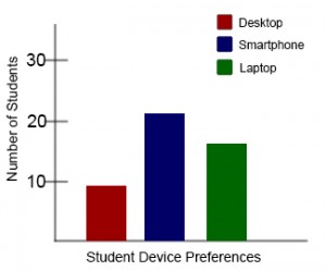
Chart 1: In this bar chart, colour is the sole means of communicating the data. |
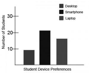
Chart 2: This view of the same bar chart displays how the chart might appear to a student who is colour blind, or whose device does not display colour. All of the meaningful data is lost. |
Example 2: Accessible Bar Chart
Students who are colour blind can distinguish between high-contrast shades. In Chart 3, contextual labels have been added to each bar at the bottom of the chart. Note that the chart will still require an alt tag.
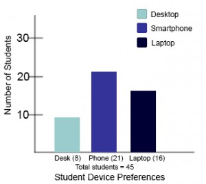
Chart 3: In this view of the bar chart, high-contrast colours have been used so that shading differences will still display in grey scale. Text labels have also been added so that the data is not just being communicated with colour.
Long description example
Figure 1.1 long description: The Wong-Baker Faces pain rating scale uses cartoon faces to illustrate the different levels of pain that correspond to a numbered scale from 1 to 10. Zero is smiling, 2 is a small smile, 4 is a straight face, 6 is a slightly sad face, 8 is a big sad face, and 10 is a bigger sad face that is crying. [Return to Figure 1.1]
Attributions
Jacob: “WFE003: Jacob” by Rosenfeld Media is used under a CC BY 2.0 Generic Licence.
Figure 1.1: “Pain Scales” by Juhan Sonin has been modified (cropped) by BCcampus and is used under a CC BY 2.0 Generic Licence.
- "Web Content Accessibility Guidelines (WCAG) 2.0: Guideline 1.1," W3C, accessed March 27, 2018, http://www.w3.org/TR/WCAG20/#text-equiv. ↵
- "Web Content Accessibility Guidelines (WCAG) 2.0: Guideline 1.4.1," W3C, accessed March 27, 2018, http://www.w3.org/TR/WCAG20/#visual-audio-contrast. ↵
- "Alt text blunders," WebAIM, accessed March 27, 2018, http://webaim.org/articles/gonewild/#alttext. ↵
- "Top 10 Tips for Making Your Website Accessible," UC Berkeley: Web Access, accessed March 27, 2018, https://webaccess.berkeley.edu/resources/tips/web-accessibility#accessible-alt. ↵
